
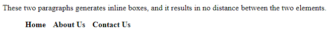
display:inline এর ব্যবহার
একাধিক html element কে একটা single লাইনে প্রদর্শনের display:inline ব্যবহৃত হয়। Inline Element গুলোতে আপনি left এবং right সাইড এ mergin এবং padding ব্যবহার করতে পারেন, কিন্তু top এবং bottom এ padding এবং mergin ব্যবহার করতে পারবেন না। নিচের উদাহরণ দেখুন:
<!DOCTYPE html>
<html>
<head>
<style>
p {
  display: inline;
}
li{
display:inline;
padding:5px;
font-weight:bold;
cursor:pointer;
}
li:hover{
background-color:green;
color:red;

}
</style>
</head>
<body>

<p>These two paragraphs generates inline boxes, and it results in</p>

<p>no distance between the two elements.</p>
<ul>
<li>Home</li>
<li>About Us</li>
<li>Contact Us</li>
</ul>

</body>
</html>
Output
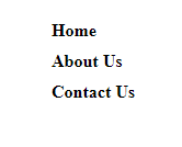
display:block
html element গুলোকে block আকারে প্রদর্শনের জন্য css এর display:block ব্যবহৃত হয়। আর html element গুলোর মধ্যে block element গুলো যেমন <p> এবং <div> tag গুলো বাই ডিফল্ট নিউ লাইনে বসে। আবার যেগুলো block element নয় সেগুলো যেমন <span> এবং <strong> ট্যাগ গুলো পাশাপাশি বসে। চলুন একটা উদাহরণ দিয়ে দেখা যাক:
<!DOCTYPE html>
<html>
<head>
<style>
li{
    display:block;
    padding:5px;
    font-weight:bold;
    cursor:pointer;
    width:100px;
}
li:hover{
    background-color:green;
    color:red;
    width:100px;
}
</style>
</head>
<body>
<ul>
<li>Home</li>
<li>About Us</li>
<li>Contact Us</li>
</ul>
</body>
</html>
Output
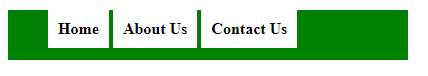
display:inline-block
display:Inline-block অনেকটা inline এর মতোই , পার্থক্য হচ্ছে display:Inline-block এ width এবং height কাজ করে , কিন্তু display:inline এ width এবং height কাজ করেনা। চলুন নিচের উদাহরণ দেখা যাক:
<!DOCTYPE html>
<html>
<head>
<style>
div{
    background-color:green;
    width:400px;
    height:50px;
}
li{
    display:inline-block;
    padding:10px;
    font-weight:bold;
    cursor:pointer;
    background-color:white;
}
li:hover{
    background-color:green;
    color:red;
}
</style>
</head>
<body>
<div>
<ul>
<li>Home</li>
<li>About Us</li>
<li>Contact Us</li>
</ul>
</div>
</body>
</html>
Output
display:contents
সরাসরি কোনো html Element, Class অথবা Id এর উপর ব্যবহৃত style কে Omit অর্থাৎ নিষ্ক্রিয় করার জন্য CSS display:contents ব্যবহৃত হয়।
প্রথমে দেখা যাক display:contents ব্যবহার ছাড়া একটা box এর Output কেমন আসে।
<!DOCTYPE html>
<html>
<head>
<style>
.content {
  border: 2px solid #999;
  background-color: #ccc;
  border-radius: 5px;
  padding: 10px;
  width: 400px;
}

.inner {
  border: 2px solid red;
  border-radius: 5px;
  padding: 10px;
}
</style>
</head>
<body>
<div class="content">
  <div class="inner">
    <p>This is the inner box. If display: contents works in your browser you will see a full width box with a red border.</p>
    <p>If display: contents does not work or if you remove the display property from .content you will see a 400 pixel box with a grey border and background color, inside will be nested the box with the red border.</p>
  </div>
</div>
</body>
</html>
Output
This is the inner box. If display: contents works in your browser you will see a full width box with a red border.
If display: contents does not work or if you remove the display property from .content you will see a 400 pixel box with a grey border and background color, inside will be nested the box with the red border.
এখন আমরা .content class এ display:contents property ব্যবহার করব , এতে আপনি দেখবেন .content class এর সব style Omit অর্থাৎ নিষ্ক্রিয় হয়ে যাবে। চলুন দেখা যাক:
<!DOCTYPE html>
<html>
<head>
<style>
.content {
  border: 2px solid #999;
  background-color: #ccc;
  border-radius: 5px;
  padding: 10px;
  width: 400px;
  display:contents;
}

.inner {
  border: 2px solid red;
  border-radius: 5px;
  padding: 10px;
}
</style>
</head>
<body>
<div class="content">
  <div class="inner">
    <p>This is the inner box. If display: contents works in your browser you will see a full width box with a red border.</p>
    <p>If display: contents does not work or if you remove the display property from .content you will see a 400 pixel box with a grey border and background color, inside will be nested the box with the red border.</p>
  </div>
</div>
</body>
</html>
Output
This is the inner box. If display: contents works in your browser you will see a full width box with a red border.
If display: contents does not work or if you remove the display property from .content you will see a 400 pixel box with a grey border and background color, inside will be nested the box with the red border.
ব্যাখ্যা: লক্ষ্য করুন .content class এর সব style Omit অর্থাৎ নিষ্ক্রিয় হয়ে গেছে।
CSS দিয়ে table তৈরী
যদিও html এর table তৈরীর tag গুলো দিয়ে যেকোনো table তৈরী অনেক সহজ , তবে css এর display property ব্যবহার করে আপনি এই কাজটি আরো ভালো এবং সহজভাবে করতে পারেন। চলুন css table property ব্যবহার করে প্রথমে একটা সাধারণ 4 row * 4 column এর একটা টেবিল তৈরী করা যাক:
<!DOCTYPE html>
<html>
<head>
    <title>CSS Display Table</title>
    <style type="text/css" media="screen">
    div{
            border:1px solid green;
        }
        .table{
            display:table;
        }
        .row{
            display:table-row;
        }
        .col{
            display:table-cell;
            height: 30px;
            text-align: center;
            padding:5px;
        }
        .caption{
            display:table-caption;
            border:none;
        }
    </style>
</head>
<body>

<div class="table">
    <div class="caption"><center>CSS Table</center></div>
    <div class="row">
        <div class="col"><strong>Id</strong></div>
        <div class="col"><strong>Name</strong></div>
        <div class="col"><strong>Mobile</strong></div>
        <div class="col"><strong>Address</strong></div>
    </div>
    <div class="row">
        <div class="col">1</div>
        <div class="col">Fuhad</div>
        <div class="col">0188</div>
        <div class="col">Dhaka,Bangladesh</div>
    </div>
    <div class="row">
        <div class="col">2</div>
        <div class="col">Mihad</div>
        <div class="col">0766</div>
        <div class="col">Khulna,Bangladesh</div>
    </div>
        <div class="row">
        <div class="col">3</div>
        <div class="col">Nihad</div>
        <div class="col">0198</div>
        <div class="col">Barishal,Bangladesh</div>
    </div>
</div>
</body>
</html>
Output
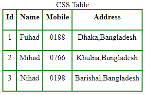
ব্যাখ্যা: লক্ষ্য করুন , আমরা এখানে display:table ব্যবহার করেছি , table start করার জন্য, তারপর display:table-row ব্যবহার করেছি table এর row গুলোর জন্য এবং display:table-cell ব্যবহার করেছি table এর কলামের cell গুলো তৈরী করার জন্য , এ ছাড়া display:table-caption ব্যবহার করেছি table এর ক্যাপশন দেওয়ার জন্য।
table এর row গুলোকে column আকারে ভাগ করা :
table এর row গুলোকে column আকারে ভাগ করার জন্য আপনি display:table-column ব্যবহার করতে পারেন , চলুন দুটি উদাহরণের মাধ্যমে ব্যাপারটা বুঝে নেয়া যাক:
Table without Column Example
<!DOCTYPE html>
<html>
<head>
    <title>CSS Table without Extra Column</title>
    <style type="text/css" media="screen">
    div{
            border:1px solid green;
        }
        .table{
            display:table;
        }
        .row{
            display:table-row;
        }
        .col{
            display:table-cell;
            height: 30px;
            text-align: center;
            padding:5px;
        }
        .caption{
            display:table-caption;
            border:none;
        }
    </style>
</head>
<body>
<div class="table">
    <div class="caption"><center>Table without Extra Column</center></div>
    <div class="row">
        <div class="col"><strong>Id</strong></div>
        <div class="col"><strong>Name</strong></div>
        <div class="col"><strong>Mobile</strong></div>
        <div class="col"><strong>Address</strong></div>
    </div>
    <div style="display:table-row;">
        <div class="col">1</div>
        <div class="col">Fuhad</div>
        <div class="col">88990</div>
        <div class="col">Dhaka,Bangladesh</div>
    </div>
    <div class="row">
        <div class="col">2</div>
        <div class="col">Zahid</div>
        <div class="col">0887</div>
        <div class="col">Khulna,Bangladesh</div>
    </div>
        <div class="row">
        <div class="col">3</div>
        <div class="col">Mihad</div>
        <div class="col">67769</div>
        <div class="col">Bogra,Bangladesh</div>
    </div>
</div>
</body>
</html>
Output
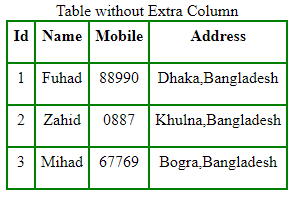
Table with Column Example
<!DOCTYPE html>
<html>
<head>
    <title>CSS Table with Extra Column</title>
    <style type="text/css" media="screen">
    div{
            border:1px solid green;
        }
        .table{
            display:table;
        }
        .row{
            display:table-row;
        }
        .col{
            display:table-cell;
            height: 30px;
            text-align: center;
            padding:5px;
        }
        .caption{
            display:table-caption;
            border:none;
        }
        .column1{
            display:table-column;
            background-color:#87CEEB;
            border:none;
        }
        .column2{
            display:table-column;
            background-color:#F44238;
            border:none;
    </style>
</head>
<body>
<div class="table">
    <div class="caption"><center>Table with Extra Column</center></div>
    <div class="column1"></div>
        <div class="column2"></div>
    <div class="row">
        <div class="col"><strong>Id</strong></div>
        <div class="col"><strong>Name</strong></div>
        <div class="col"><strong>Mobile</strong></div>
        <div class="col"><strong>Address</strong></div>
    </div>
    <div style="display:table-row;">
        <div class="col">1</div>
        <div class="col">Fuhad</div>
        <div class="col">899</div>
        <div class="col">Dhaka,Bangladesh</div>
    </div>
    <div class="row">
        <div class="col">2</div>
        <div class="col">Zahid</div>
        <div class="col">8776699</div>
        <div class="col">Khulna,Bangladesh</div>
    </div>
        <div class="row">
        <div class="col">3</div>
        <div class="col">Mihad</div>
        <div class="col">76699</div>
        <div class="col">Bogra,Bangladesh</div>
    </div>
</div>
</body>
</html>
Output
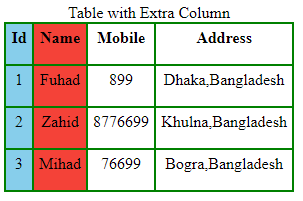
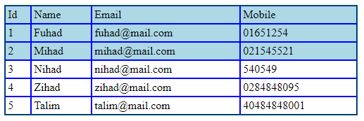
table এর row গুলোকে কে group আকারে ভাগ
table এর row গুলোকে group আকারে ভাগ করার জন্য আপনি display:table-row-group; ব্যবহার করতে পারেন , চলুন উদাহরণের মাধ্যমে ব্যাপারটা বুঝে নেয়া যাক:
<!DOCTYPE html>
<html>
<head>
    <title>Table Row Group</title>
    <style type="text/css" media="screen">
        .table {
            display: table;
            border:1px solid green;
            width:500px;
        }
        .table-row-group {
            display: table-row-group;
        }
        .table-row {
            display: table-row;
        }
        .table-cell {
            display: table-cell;
            padding: .2em;
            border:1px solid blue;
        }
        .table-row-group:first-child {
            background-color: lightblue;
        }
    </style>
</head>
<body>
<div class="table">
  <div class="table-row-group">
    <div class="table-row">
      <div class="table-cell">Id</div>
      <div class="table-cell">Name</div>
      <div class="table-cell">Email</div>
      <div class="table-cell">Mobile</div>
    </div>
    <div class="table-row">
      <div class="table-cell">1</div>
      <div class="table-cell">Fuhad</div>
      <div class="table-cell">fuhad@mail.com</div>
      <div class="table-cell">01651254</div>
    </div>
    <div class="table-row">
      <div class="table-cell">2</div>
      <div class="table-cell">Mihad</div>
      <div class="table-cell">mihad@mail.com</div>
      <div class="table-cell">021545521</div>
    </div>
  </div>
  <div class="table-row-group">
    <div class="table-row">
      <div class="table-cell">3</div>
      <div class="table-cell">Nihad</div>
      <div class="table-cell">nihad@mail.com</div>
      <div class="table-cell">540549</div>
    </div>
    <div class="table-row">
      <div class="table-cell">4</div>
      <div class="table-cell">Zihad</div>
      <div class="table-cell">zihad@mail.com</div>
      <div class="table-cell">0284848095</div>
    </div>
    <div class="table-row">
      <div class="table-cell">5</div>
      <div class="table-cell">Talim</div>
      <div class="table-cell">talim@mail.com</div>
      <div class="table-cell">40484848001</div>
    </div>
  </div>
</div>
</body>
</html>
Output
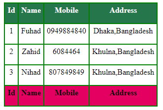
css table-header-group এবং table-footer-group এর মাধ্যমে table এর header এবং footer নির্ধারণ :
table এর এক বা একাধিক row কে header করার জন্য আপনি display:table-header-group; ব্যবহার করতে পারেন ,আবার এক বা একাধিক row কে footer করার জন্য আপনি display:table-footer-group; ব্যবহার করতে পারেন চলুন উদাহরণের মাধ্যমে ব্যাপারটা বুঝে নেয়া যাক:
<!DOCTYPE html>
<html>
<head>
    <title>Display Table</title>
    <style>
        div{
            border:1px solid green;
        }
        .table{
            display:table;
        }
        .row{
            display:table-row;
        }
        .col{
            display:table-cell;
            height: 30px;
            text-align: center;
            padding:5px;
        }

        .table-header{
            display: table-header-group;
            background-color:#25764A;
            color:#fff;
            font-weight: bold;
        }
        .table-footer{
            display: table-footer-group;
            background-color: #E40061;
            font-weight: bold;
        }
   </style>
</head>
<body>
<div class="table">
    <div class="row">
        <div class="col">1</div>
        <div class="col">Fuhad</div>
        <div class="col">0949884840</div>
        <div class="col">Dhaka,Bangladesh</div>
    </div>
    <div class="row">
        <div class="col">2</div>
        <div class="col">Zahid</div>
        <div class="col">6084464</div>
        <div class="col">Khulna,Bangladesh</div>
    </div>
    <div class="row">
        <div class="col">3</div>
        <div class="col">Nihad</div>
        <div class="col">807849849</div>
        <div class="col">Khulna,Bangladesh</div>
    </div>
    <div class="table-header">
    <div class="row">
        <div class="col">Id</div>
        <div class="col">Name</div>
        <div class="col">Mobile</div>
        <div class="col">Address</div>
    </div>
    </div>
    <div class="table-footer">
    <div class="row">
        <div class="col">Id</div>
        <div class="col">Name</div>
        <div class="col">Mobile</div>
        <div class="col">Address</div>
    </div>
    </div>
</div>
</body>
</html>
Output
display:table ব্যবহার করে navigation menu তৈরীর কৌশল:
display:table ব্যবহার করে কিভাবে navigation menu তৈরী করা যায় নিচে তা দেখানো হলো
<!DOCTYPE html>
<html>
<head>

    <style type="text/css" media="screen">
   /* Dynamic navigation stays in middle */

body {
  text-align: center;
  background: #FFD34E;
  color: #FFFAD5;
  text-shadow: 0 1px 1px rgba(0,0,0,0.2);
}

ul {
  list-style: none;
  margin: 0;
  padding: 0;
}

li {
  float: left;
  background-color: #BD4932;
}

li a {
  display: block;
  padding: .5em 1em;
  color: #FFFAD5;
}

.nav-table {
  display: table;
  margin: auto
}
.orange {
  color: #BD4932;
}

    </style>
</head>
<body>
<h2>Navigation With <span class="orange">display:table</span></h2>
<nav role='navigation' class="nav-table">
  <ul>
    <li><a href="#">Home</a></li>
    <li><a href="#">About</a></li>
    <li><a href="#">Clients</a></li>
    <li><a href="#">Contact Us</a></li>
  </ul>
</nav>
</body>
</html>
Output

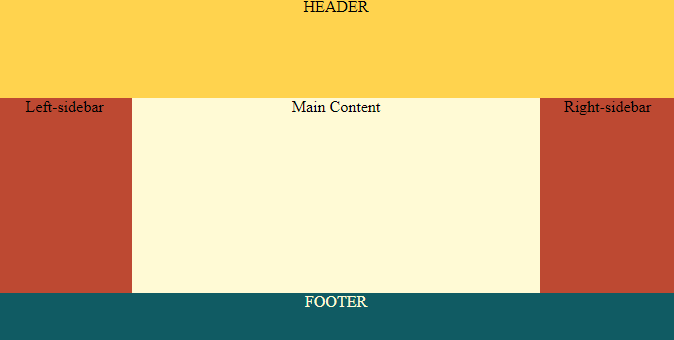
display:table ব্যবহার করে Responsive Layout তৈরীর কৌশল:
display:table ব্যবহার করে কিভাবে Responsive Layout তৈরী করা যায় নিচে তা দেখানো হলো
<!DOCTYPE html>
<html>
<head>

<style type="text/css" media="screen">
   body {
    background: #FFFAD5;
    color: black;
   }
.wrapper {
  height: 100%;
  display: table;
  width: 100%;
  text-align: center;
}
.header {
  display: table-row;
  height: 100px;
  background: #FFD34E;
}
.main {
  height: 100%;
  display: table;
  width: 100%;
}
.box {
  display: table-cell;
}
.sidebar {
  width: 20%;
  background: #BD4932;
}
.footer {
  display: table-row;
  height: 50px;
  background: #105B63;
  color: #FFFAD5;
}
/*====== Ignore section below ======*/
/* Basic Style*/
* {
  margin: 0;
  padding: 0;
}
html,
body {
  height: 100%;
}
    </style>
</head>
<body>
<div class="wrapper">
  <div class="header">HEADER</div>
  <div class="main">
    <div class="box sidebar">Left-sidebar</div>
    <div class="box content">Main Content</div>
    <div class="box sidebar">Right-sidebar</div>
  </div>
  <div class="footer">FOOTER</div>
</div>
</body>
</html>
Output
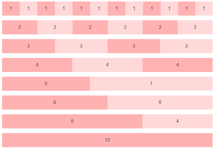
display:table ব্যবহার করে Responsive grid Layout তৈরীর কৌশল:
display:table ব্যবহার করে কিভাবে Responsive Grid Layout তৈরী করা যায় নিচে তা দেখানো হলো
<!DOCTYPE html>
<html>
<head>

<style type="text/css" media="screen">
 * { box-sizing: border-box; }

body{
    font-family:sans-serif;
}

/* Holds and centers the site content */
.container {
  max-width: 940px;
  margin-right: auto;
  margin-left: auto;
}


/*
 * The Grid
 */

@media (min-width: 600px) {
  /* Add `.grid` for the table */
  .grid {
    display: table;
    width: 100%;
    table-layout: fixed;
  }

  /* Add `.col` for the table cells, or columns */
  .col {
    display: table-cell;
  }

  /* Set the widths */
  .col-1 { width: 8.333333%; }
  .col-2 { width: 16.666667%; }
  .col-3 { width: 25%; }
  .col-4 { width: 33.333333%; }
  .col-5 { width: 41.666667%; }
  .col-6 { width: 50%; }
  .col-7 { width: 58.333333%; }
  .col-8 { width: 66.666667%; }
  .col-9 { width: 75%; }
  .col-10 { width: 83.333333%; }
  .col-11 { width: 91.666667%; }
  .col-12 { width: 100%; }

  /* Padded columns */
  .grid-padded {
    margin-left:  -1rem;
    margin-right: -1rem;
  }
  .grid-padded .grid {
    border-spacing: 1rem 0;
  }
}


/*
 * Vertically center grid content
 *
 * Requires content within the column to be inline or inline-block.
 */

.grid-align-middle .col {
  vertical-align: middle;
}

/* Make it red for easy views */
.grid-example {
  margin-bottom: 1rem;
}
.grid-example .col {
  line-height: 3;
  text-align: center;
  color: #333;
  background-color: rgba(255,0,0,.15);
}
.grid-example .col:nth-child(odd) {
  background-color: rgba(255,0,0,.3);
}

/* Nested grid examples need outdenting because padding. */
.grid-example .grid-example {
  margin-top: .5rem;
  margin-bottom: 0;
}

/* Increase height of vertically centered example */
.grid-example.grid-align-middle {
  height: 200px;
}
.grid-example.grid-align-middle .col {
  min-height: 3rem;
  line-height: 1.5;
}
    </style>
</head>
<body>
<div class="grid grid-example">
    <div class="col col-1">1</div>
    <div class="col col-1">1</div>
    <div class="col col-1">1</div>
    <div class="col col-1">1</div>
    <div class="col col-1">1</div>
    <div class="col col-1">1</div>
    <div class="col col-1">1</div>
    <div class="col col-1">1</div>
    <div class="col col-1">1</div>
    <div class="col col-1">1</div>
    <div class="col col-1">1</div>
    <div class="col col-1">1</div>
</div>
<div class="grid grid-example">
    <div class="col col-2">2</div>
    <div class="col col-2">2</div>
    <div class="col col-2">2</div>
    <div class="col col-2">2</div>
    <div class="col col-2">2</div>
    <div class="col col-2">2</div>
</div>
<div class="grid grid-example">
    <div class="col col-3">3</div>
    <div class="col col-3">3</div>
    <div class="col col-3">3</div>
    <div class="col col-3">3</div>
</div>
<div class="grid grid-example">
    <div class="col col-4">4</div>
    <div class="col col-4">4</div>
    <div class="col col-4">4</div>
</div>
<div class="grid grid-example">
    <div class="col col-5">5</div>
    <div class="col col-7">7</div>
</div>
<div class="grid grid-example">
    <div class="col col-6">6</div>
    <div class="col col-6">6</div>
</div>
<div class="grid grid-example">
    <div class="col col-8">8</div>
    <div class="col col-4">4</div>
</div>
<div class="grid grid-example">
    <div class="col col-12">12</div>
</div>
</body>
</html>
Output

2 Comments
I’m extremely pleased to discover this website. I wanted to thank you for ones time just for this fantastic read!! I absolutely enjoyed every part of it and i also have you bookmarked to see new stuff in your site.
I got what you intend,bookmarked, very decent website. https://pozyczkiland.pl/